3 tips for using colour in UI design
As I've just talked about accessible colour contrast, I thought I'd round up some quick tips for using colour in UI design.
As I was learning to design, I found colour to be one of the hardest things to get right, as the possiblilities are endless.
Here are three things that helped me work with colour in design.
1. Design in Grayscale first
Partly an excuse to not have colour choice block you, but thinking in black and white makes your design not overly rely on colour.
Think about what your primary calls-to-action your want users to focus on on each screen, and make those more prominent (darker or lighter, depending on the rest of the interface).
2. Limit the number of colours in your design
Often I've heard people say limit your colours to 3 at a maximum. Unless you are a colour expert, it can get overwhelming.
A nice trick I've seen people use is using darker and lighter shades of a colour to keep the overall number of colours down.
Look at the example below: you can see just by adding black and white to a base colour for the search UI, the app looks more harmonious than if you'd used other colours.
Try saturating your blacks and whites with a tint of your primary colour for extra credit.
3. The 60-30-10 rule
Liberally stolen from interior design, the 60-30-10 rule is about relative distribution of colour, and creating a well balanced palette.
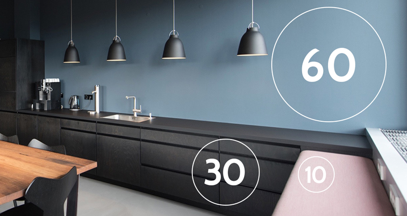
- 60% of the UI should be dedicated to one colour (usually a neutral or light colour).
- the second 30% should be a complementary colour (think the header, nav and general UI chrome).
- Finally the 10% should be an accent colour, often sharply contrasting, and used for highlighting things you want the user to notice.
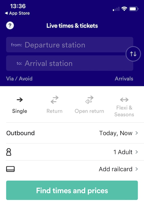
You can actually see it in the Trainline screenshot above, and if I hadn't cut off the button of the screenshot, over 60% of it is white.
There's so much one can do with colour, but these three starting points should help you get going, and the following links provide ma much more in depth look at the theory of colour:
Further resources
Fruto Studio - A guide to colour in UI design
Colour Design Theory