Accessible colour contrast
When designing and developing user interfaces, it's always good to use a colour contrast checker to make sure text is clearly readable, especially when placed against coloured backgrounds.
WCAG 2.0 level AA requires a contrast ratio of at least 4.5:1 for normal text and 3:1 for large text. WCAG 2.1 requires a contrast ratio of at least 3:1 for graphics and user interface components (such as form input borders). WCAG Level AAA requires a contrast ratio of at least 7:1 for normal text and 4.5:1 for large text.
WebAIM
This is especially important when designing using non-colour calibrated monitors, and in any case, you cannot guarantee what kind of screen someone else may be using when viewing your user interfaces, so the clearer you can make things, the better.
Tools I like to use to check colour contrast
Figma Plugin - Able
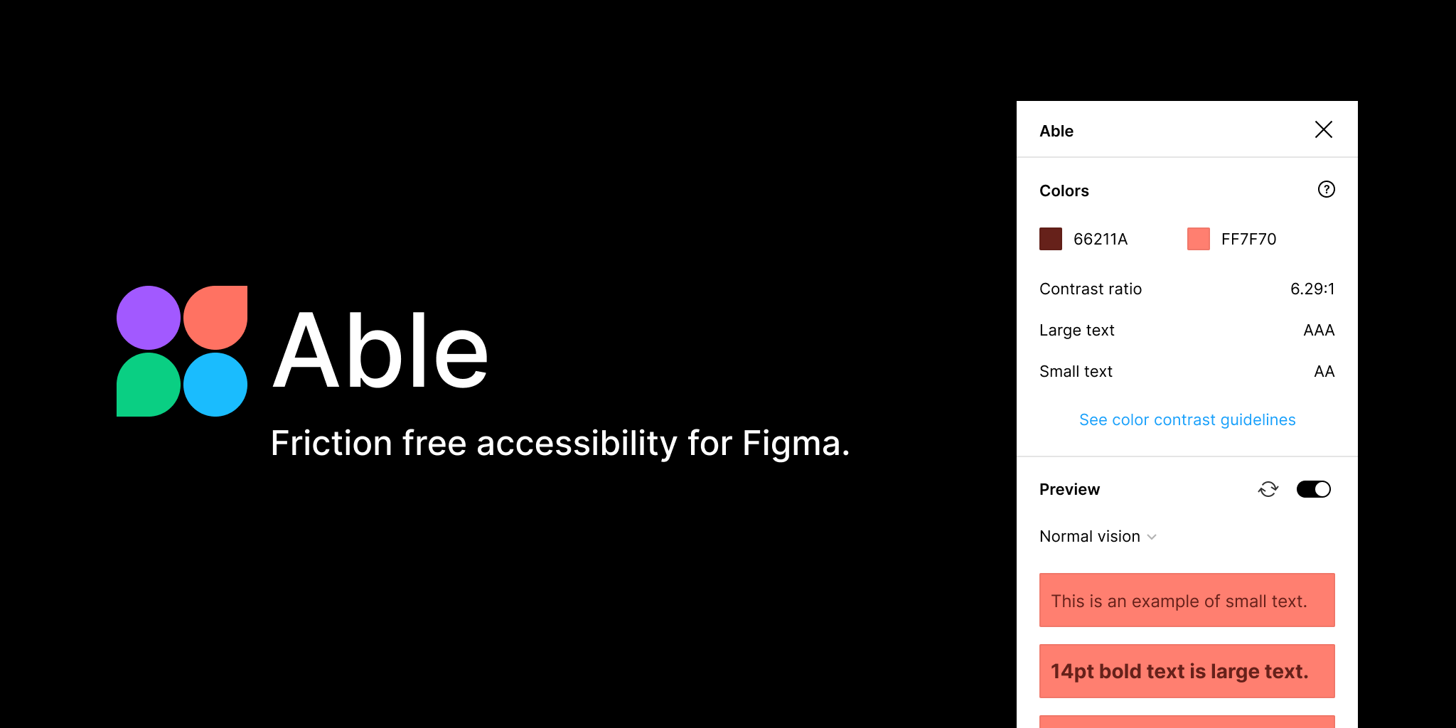
- Allows you to select two layers and check contrast ratios
- Modes for simulating colour blindness
Able - Friction Free Accessibility Plugin
Natively on the Mac - ColorSlurp
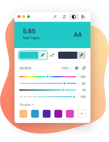
- Colour picker (free)
- Contrast checker (premium paid for)
- Lots of other useful features
ColorSlurp
Online - WebAIM
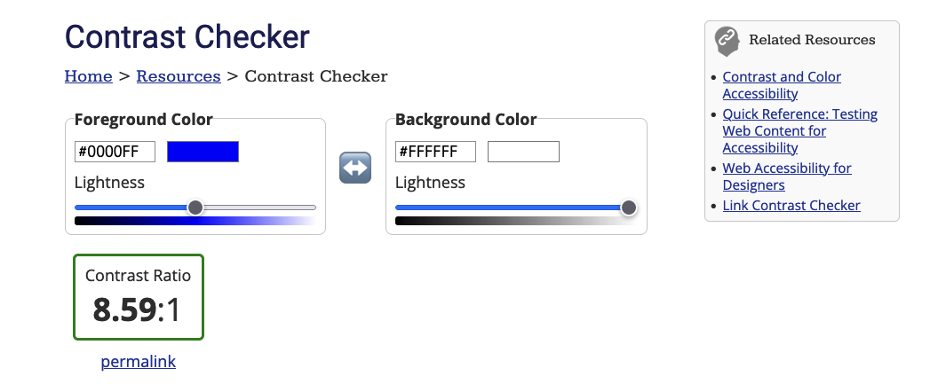
- Contrast checker
- Good explanation, as well as pass/fail for normal text, Large Text, and User Interface Components
WebAIM
Devtools contrast checker - in your browser for free

Open up Developer tools in Firefox or Chrome and click any colour chip in the Style panel, and it will give you the contrast, AA or AAA rating, and whether it's for large or small text, and you can edit colour values inline.