When to use uppercase in your designs
Use UPPERCASE (or 'all-caps') in your designs sparingly as the letterforms for uppercase letters are harder for the eye to distinguish, because of the equal height of all letter forms - it's difficult to read and scan.
The four days must have added nearly another fifty miles to their journey, and Joe was jubilant. He began to predict that they would reach the Yukon in good season, and get out by steamer from St. Michael that fall.
versus:
THE FOUR DAYS MUST HAVE ADDED NEARLY ANOTHER FIFTY MILES TO THEIR JOURNEY, AND JOE WAS JUBILANT. HE BEGAN TO PREDICT THAT THEY WOULD REACH THE YUKON IN GOOD SEASON, AND GET OUT BY STEAMER FROM ST. MICHAEL THAT FALL.
It can all feel a bit SHOUTY!
Where uppercase can be OK:
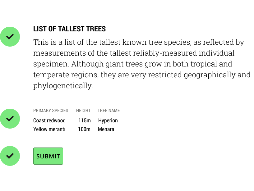
- Small Headings
- Button text
- Table Headers
- Form labels
Uppercase draws the users attention to small bits of text.
The alignment of the letter forms creates a sense of alignment, and can be used to bring consistency to varying bits of text.