Better design through white space
“Design is as much an act of spacing as an act of marking.” – Ellen Lupton
Often new designers (and some clients!) see white space as a wasted element, and want to cram as much into an interface as possible.
Try doubling whitespace in a design, and if too much dial it back a bit. Your eye will know when it feels right.
Put space between your lines, elements and groups of elements.
Groups of related things should be closer together.


Think of a shop window - you'll notice that luxury storefronts always show less in the window, and this heightens the sense of importance of the things within it.
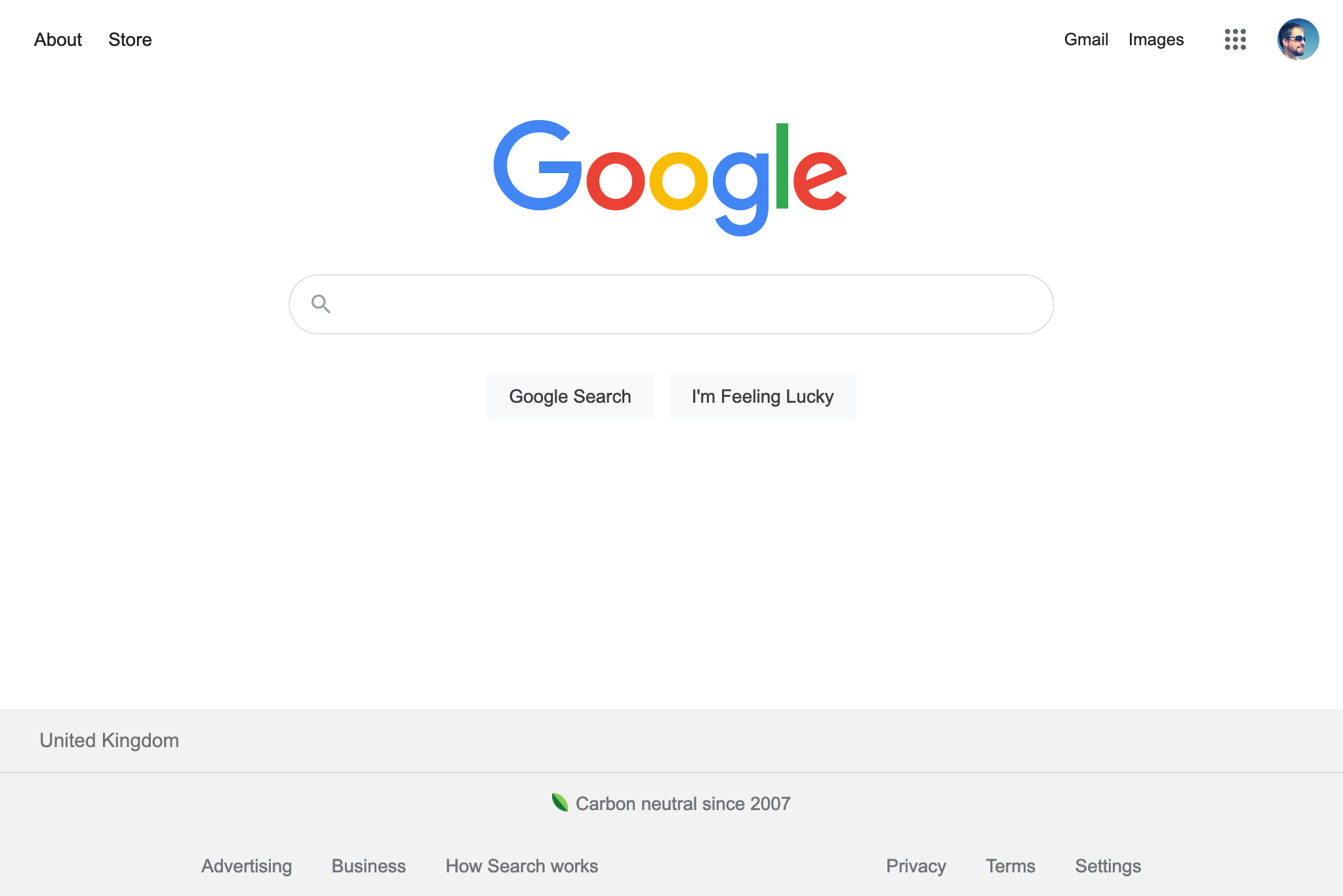
While dense UI has it's place (the subject of a future post), not using whitespace can be a mistake in blog posts, landing pages, controls and tables.
Whitespace can be used to both draw attention to things as well as make your UI look 'more designed'.