Achieve consistency using a font superfamily
Nice free Google Font superfamilies
If you are new to typography, sometimes choosing a type superfamily can really help give you a level up without much effort.
What is a font superfamily?
According to wikipedia:
In typography, a font superfamily or typeface superfamily is a font family containing fonts that fall into multiple classifications ...The result is a set of fonts that, while belonging to different classes such as sans and serif, have a similar appearance. - wikipedia
Usually designed by a single foundry or designer, you'll have a set of fonts designed to work well together without having to make sure they pair well.
This can be great for editorial work, where you often want headlines to pair very well with body text.
Nice superfamilies in Google fonts
Pretty much all the below choices have multiple weights, so they work in many situations.
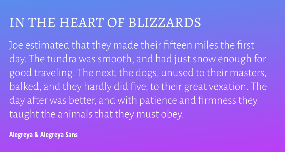
Alegreya & Alegreya Sans
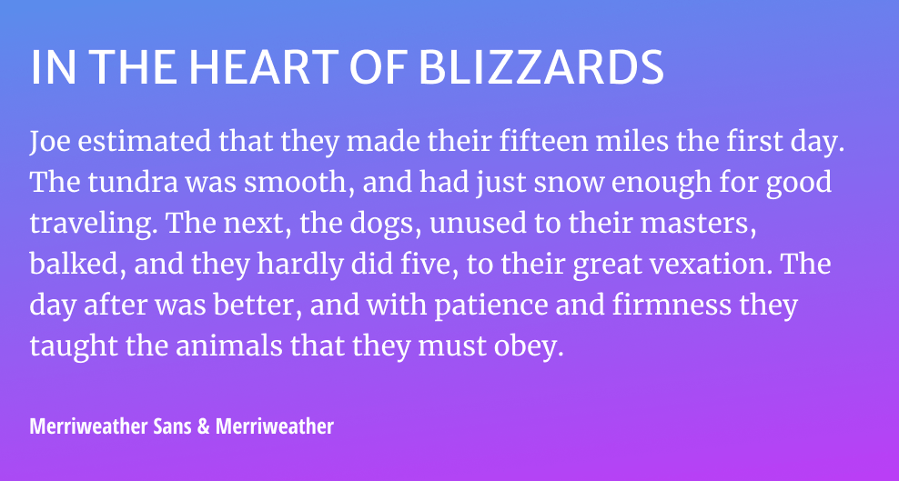
Merriweather & Merriweather Sans
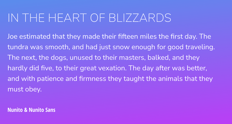
Nunito & Nunito Sans
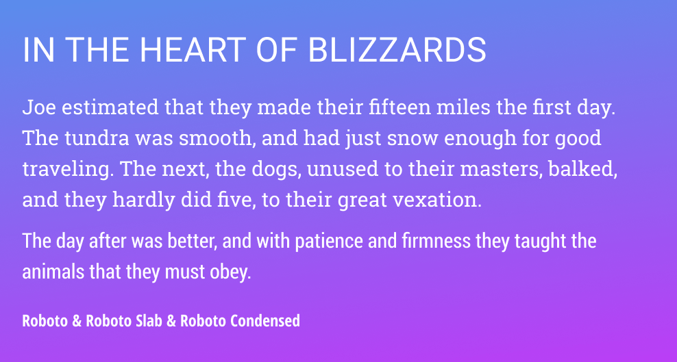
Roboto Slab & Roboto
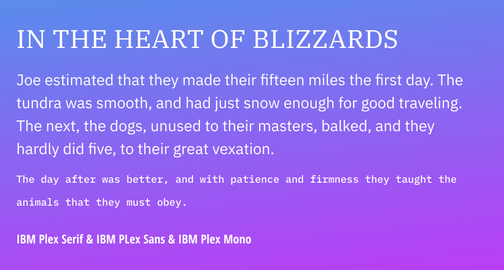
IBM Plex Sans & Serif & Mono
IBM Plex, Alegreya and Nunito are particular favourites.
Superfamilies with monospaced fonts like Plex can be great for data tables, as any numbers will line up with one another perfectly.
Roboto Condensed can be great for UI that has very long labels.
Update: Robot now has Roboto Serif as well, which looks lovely - even more reason to try it!
IBM Plex Sans is very readable if you need to make small UI controls.
(text source: Project Gutenberg)