Featured in dot net magazine responsive design gallery
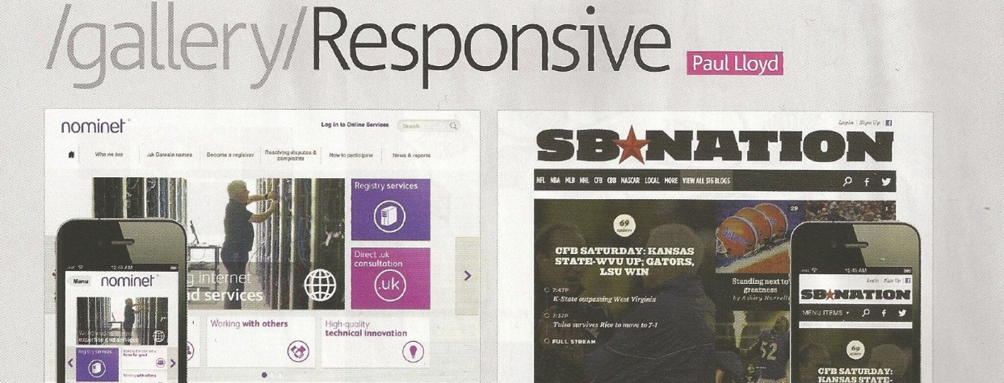
After launching our most recent site, www.nominet.org.uk, I was really pleased to see it featured in .net magazine.
I answered a few questions for Paul Lloyd, and as these got edited down by the magazine due to limited column inches, I thought I would publish my responses to Paul's questions in full.
Why did you choose a responsive approach?
While responsive design is definitely not a panacea, because we were already working on reducing/rewriting the website content, it made real sense to try a responsive approach.
Going the responsive route provided us with a framework to prioritise features with stakeholders, forced us to keep things simple, and display our content in a nicer way on a variety of devices.
Knowing that you wanted to go responsive, did your design process adapt to accomplish this?
It had to. When we were sketching ideas for the site out with our designers, everything had to have a mobile representation that worked with the same content.
Ideas that worked on the desktop often didn't work so well on mobile, so we had to keep both at the forefront of our minds.
What was the relationship between the designers and developers working on this project? Would you change anything about that on future projects?
Really good. The key really was lots of initial communication/face-to-face time. Sitting developers and designers down together very early on to brainstorm over several days really helped iron out some initial challenges.
We worked with an agency (Nomensa) who provided us design comps based on our initial workshops and also worked with our stakeholders improving site copy, and we did all the development (Drupal build, a responsive custom theme, HTML/CSS and further design changes).
In terms of changing things, probably more prototyping. Some things that look good on a design often have issues when you come to use them in a browser. We were under tight time constraints, so did the best with the time at hand.
Did you encounter any tricky problems during the design of this site? How did you solve them?
Our initial designs catered for both desktop and mobile, but there are a lot of sizes in-between to consider, and trying to get things (like landing page tiles) to reflow nicely between the two took more time than we anticipated.
To save our developers from having to cater for dozens of different devices, rather than targeting specific tablet breakpoints, we just resized the browser and added targeted media queries to specific page elements when things started looking wrong. Working to a grid really helped.
Aside from layout, what other considerations did you make for users visiting the site on mobile devices?
Navigation was a big concern. We tried a variety of navigation patterns, and ended up going for something that resized down to mobile, then switched to a left nav flyout Brad Frost's list of navigation patterns was very useful).
It's still not quite perfect, and we are trying a few other options to improve it for a future version. Navigation is easy on smaller sites, but when you have a deeper IA with potentially long page titles it becomes a real challenge.
Did you learn anything during this design that you'd apply to future responsive projects?
We found grouping targeted media queries under specific styles made CSS maintenance much easier. CSS Preprocessors really helped for setting things like colour variables and handling vendor specific properties consistently, however it made writing unnecessarily complex CSS selectors a little too easy.
There are a lot of people in the web community railing for/against LESS and SASS, but really they are just tools and it's just down to how you use them - for good or for evil.
Building on this, for future projects I think we will be looking using a combination of using more modular CSS and style guides at an early stage to help with prototyping.
Responsive design is hard to get right, and while it wasn't our first responsive project, it was the largest and most challenging so far. There are some really interesting discussions happening right now on the web on things like how to deal with proper responsive images and deeper optimisation on several levels, and as a developer it's easy to get obsessed with these things.
However you have to get the basics right first to make the most impact - good copy, a good IA/navigation and keeping content as simple and relevant to your user as possible.