Case study: Designing a better editing experience for Prezly
How I approached a 6-week redesign, and some ideas you can try.
Introduction
This is a high-level summary of a project I did product design for in October 2022, how we approached it, what happened, the outcome and some things I learned.
At Prezly, we are now using Shape Up (a product methodology created by the 37 Signals folks) and this was our first 6-week project since starting this way of working, which was both exciting and scary.
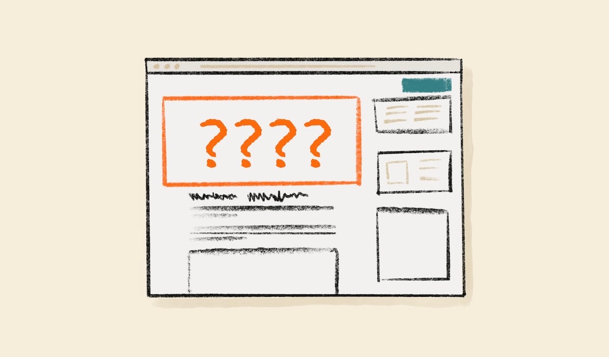
The problem
When I joined the team at Prezly in June 2022, one of the key challenges I was given was to help redesign the story editing experience.
This was one of the things that attracted me to Prezly - Gijs (one of the founders) blogs openly about building products and wrote about the challenges redesigning the writing and publishing experience (so refreshing to see!) and I could immediately see how I could contribute with my skillset.
The core editor itself is a solid experience (built on top of SlateJS), but (as happens organically with a lot of software) the surrounding user interface had had features added over time and wasn't laid out optimally.
Things that struck me:
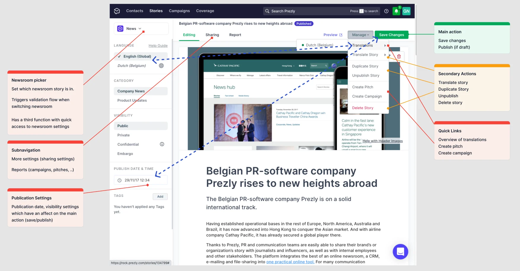
- a lot of controls were visible all at once.
- Some labelling was unclear.
- Publish settings were in several places.
- It wasn't always clear what publish settings were set, or whether a story had been shared or not.
- Some things (like translations) were hidden behind menus.
- Some controls had multiple functions which weren't at all clear.
The time it takes to make a decision increases with the number and complexity of choices - Hicks's Law [1]
Even though it wasn't complex, I found it a bit overwhelming and wanted to simplify things.
The challenges
Things I had to consider:
- Improve clarity and usability - address all the identified problems with the newsroom picker, sub-navigation, hidden links, and settings spread all over the place.
- Try not to alienate existing users - we already had a large user base who were familiar with the tool.
- Consider both solo users and enterprise teams - it had to cater for users on smaller plans, and scale up to large teams with lots of features.
- Be somewhat future proof 😅 - there was a big list of new features that we wanted to add to the editor, but the existing UI didn't really have the real estate needed. Whatever I came up with had to have growing room.
- Be more responsive - the previous editor was desktop first and didn't work well on smaller screens or browser windows. User interviews told us people often had multiple windows open to copy content into the editor.
- Allow for a more focused editing experience - sometimes people just want to write without distraction! I love things like iAWriter with their focus modes - could something like this be incorporated? Could this help the design work on smaller screens? (Spoiler: yes! It could).
My process
Get to know the problem space really well
This is a bit of a cheat as wasn't within the 6 weeks of the project, but coming in new to the story editor, I knew I had only a few months to use it before this project would land.
I used it as much as I could writing up project reports in it and doing presentations using it, getting as much time to familiarise myself with the edges of it.
Observe users as much as you can
I interviewed users and observed them using the editor. Using a suite of analytics tools (Mixpanel, FullStory) alongside personal observation, I mapped out what users used the most, and the least, where they seemed to fly, and where they got stuck.
As designers, we also have rotating days working with the support team, which really helped, both from the understanding and the empathy front when talking to real users about challenges they had.
Run "Customer Empathy Sessions" with new staff
We have a practice here of running all new staff through "Customer Empathy Sessions" [2] - scenarios where we set a task and ask new staff to role-play customers performing those tasks. We record these and have a mix of designers and developers watch and take notes, and debrief at the end.
As I knew I'd have to tackle this project eventually, I got involved and ran as many of these as possible. It's incredible what you can learn viewed through a fresh pair of eyes, especially when you aren't allowed to talk during the session.
Check out Customer Empathy Sessions! Even running the same session over with different people surfaces new things every time.
Consider new users and the beginner's mindset
It's really hard to design a product when you are super familiar with it, and I had to keep questioning my assumptions, and coming back to a "beginner's mindset", thinking about what guidance we could give a new user when they first come to the editor, with good empty states and sensible defaults.
I'd made copious notes/run a UX audit even before I started the job, so I referred to past-me - as a new user to it myself what did I think?
Test with fresh users: I showed the editor (and my new designs eventually) to people who had never seen it for general comprehension.
Get feedback early and stay humble
I'd fixed some of the basic UX and clarity issues and got early designs in front of colleagues as fast as I could in a rough state.
This was probably the best thing I could have done, as issues with early designs were identified, and I was able to course-correct fast.
If I'd sat on them until I thought they were perfect, I would have run out of time and been working on the wrong thing.
Remember: you are not your designs - if they don't work, and you find out early, you can fix them! Early constructive criticism is good - it's not personal.
Prototype in high fidelity and test with users
We are in a golden age of design tools - no longer do we have to sweat for days pushing pixels in Photoshop when we have modular component-based systems like Figma.
I walked through lots of scenarios - a new empty story, and an existing story for both basic and advanced users, but only tested external users on the things I was really unsure about.
Save your customers time for the valuable stuff - there's a lot you can do with internal 'guerilla' testing.
Build rich prototypes and test with users as if it's the real thing.
When testing, don't drop users into a screen without context - even a precursor screenshot can help set the scene - in reality, they would have always started somewhere.
Iterate lots fast
Try lots of different ideas (divergent thinking), and get them in front of others - and throw out things fast. Explore in low fidelity before narrowing down (convergent thinking)[3].
Sometimes wireframes aren't good enough for comprehension when talking to real users (but might be good enough for internal users).
It doesn't have to be perfect at the idea stage, but good enough for people to understand it.
Design guidelines/principles
Come up with a set of design principles to guide decisions
Having identified some of the usability issues, I didn't want to make the same mistakes again.
I wrote up a set of design principles which I pinned on the wall above my monitor. These touched on things like clarity, simplicity, good way-finding, having a clear call to action and good defaults.
Set principles - you don't always work at peak brain, so it's nice to have things to look to when you get stuck.
Build on work that has come before
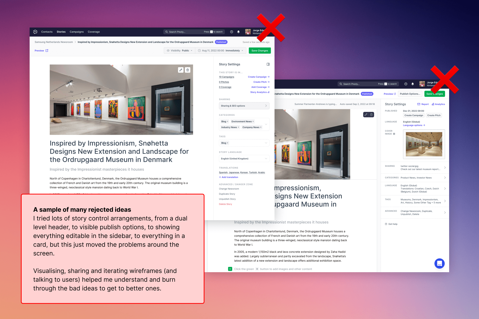
I was coming in cold to a situation that had been explored before by previous designers - there were lots of Figma/FigJam files to review and past discussions in Linear (the benefit of a remote-first company - a lot of discussions are all in writing!).
First I had to review existing attempts at redesign with an open mind (there were lots of good ideas), figure out what the impasses were, and take the good stuff while leaving things that didn't work - panning for gold somewhat.
Luckily my aforementioned design principles came in handy - then it became less about opinion vs opinion, and more about objectives.
Interviewing people involved prior also helped, and active listening without forming opinions immediately was key, and asking good open interview questions helped.
Practice good interview techniques: Be curious. Also shut up and listen.
Look to other products for inspiration
What do other editors/complex apps with lots of settings do? What lessons could I learn?
I reviewed WordPress, Ghost, Notion, Linear, and Gmail and took a lot of screenshots. A lot were quite complex and overwhelming.
What other design patterns are out there for complex app interfaces? After all, everything is a remix.
I loved Jonnie Hallman's idea of a nested / stacked drawer system, and I wanted to see if we could use that idea to layer content.
This ended up working well, and I might write a separate post on this.
Use existing patterns
By leveraging existing mental models, we can create superior user experiences in which the users can focus on their tasks rather than on learning new models.
Users spend most of their time on other sites. This means that users prefer your site to work the same way as all the other sites they already know.
Laws of UX
Be inspired but don't copy - every platform has its own challenges, and has different user needs - it's not one size fits all.
Allow designs to breathe - reduce the amount of lines and boxes
I find you can do a lot with relative contrast, weight and text colour, and aligning things carefully instead of using lots of containing boxes always makes designs feel cleaner.
If you are designing around user content, check the longest possible lengths of things, and ensure these are handled OK - test the boundaries of things.
Step back and squint at your designs - can you see what the clear calls to action are?
Signpost things
Set the scene - what do people need to know before they do anything? Ensure you have suitable way-finding (breadcrumbs, page titles etc) so that if users land on a page they know where they are.
Group related tasks - get the information architecture right
Tasks that people could perform loosely could be grouped into three buckets:
- Things that changed the state of the story (publishing, scheduling).
- Things that changed settings of the story (metadata, social sharing info).
- Things that did something with the story that took users out of the editor (duplicating a story, deleting a story, translating a story).
I found that grouping these logically helped me design with clarity, required less labelling, and made more sense to users.
Support icons with text
Avoid using only icons in your designs unless you are 100% sure people know what they are - test them.
Keep users informed
Keeping the user informed when they perform an action - always follow up with some indicator so they know something has been saved.
Don't make things scary - highlight the consequences of dangerous actions before users do them and allow users to back out of things where possible. Someone has accidentally published a story? Let them unpublish easily.
How we delivered it
Break it into smaller deliverables
If you can, try not to do all the things at once.
Before we started the project, I identified small pieces of work that could be done in isolation that would make the project easier and worked on them ahead of time.
If there are smaller things you can break off and ship separately, do them to avoid shipping in a big bang at the end.
Avoid Big-Design-Up-Front
This isn't Waterfall Development. Try to avoid 'solutionising' and getting things perfect - it's a collaborative and explorative process that you will have no idea about a lot of at the start. Trust the process.
Agree to disagree and commit regardless
Ever got to an impasse on a decision that went round and round in circles? It happens often in software projects.
I was lucky to be working with some amazing developers and content writers that I trusted, who had worked with me before and all had a good sense of UX and Design.
They pushed back when they disagreed with something I'd done, but were happy to disagree and commit on occasion when we need to prove something in the browser/test with users.
I was also wrong on more than one occasion. Hears people gasp audibly 😅
Pick your battles - you have a certain amount of credit, and sometimes letting go of things is the right thing to do and keeps the project moving.
Work to a fixed time with variable scope
One of the challenges/benefits of working with Shape up is you are timeboxed - there are no estimates, you just try and build and ship what you think you can within the time allocated.
As a result, you can't always achieve all the things you want, so have to let go of a lot of nice-to-haves.
Ask yourself - if we do this extra thing will we run over, or can we ship a great core experience without it? Focus on the important stuff and simplify where you can.
Make a kick-ass half rather than a half-assed whole
Jason Fried
Deliver fully working things end-to-end - scope out the work upfront
There's no point doing the front end first and the backend last - you will always run into problems.
Zoom out and map the project into scopes with your team when you start - divide it up:
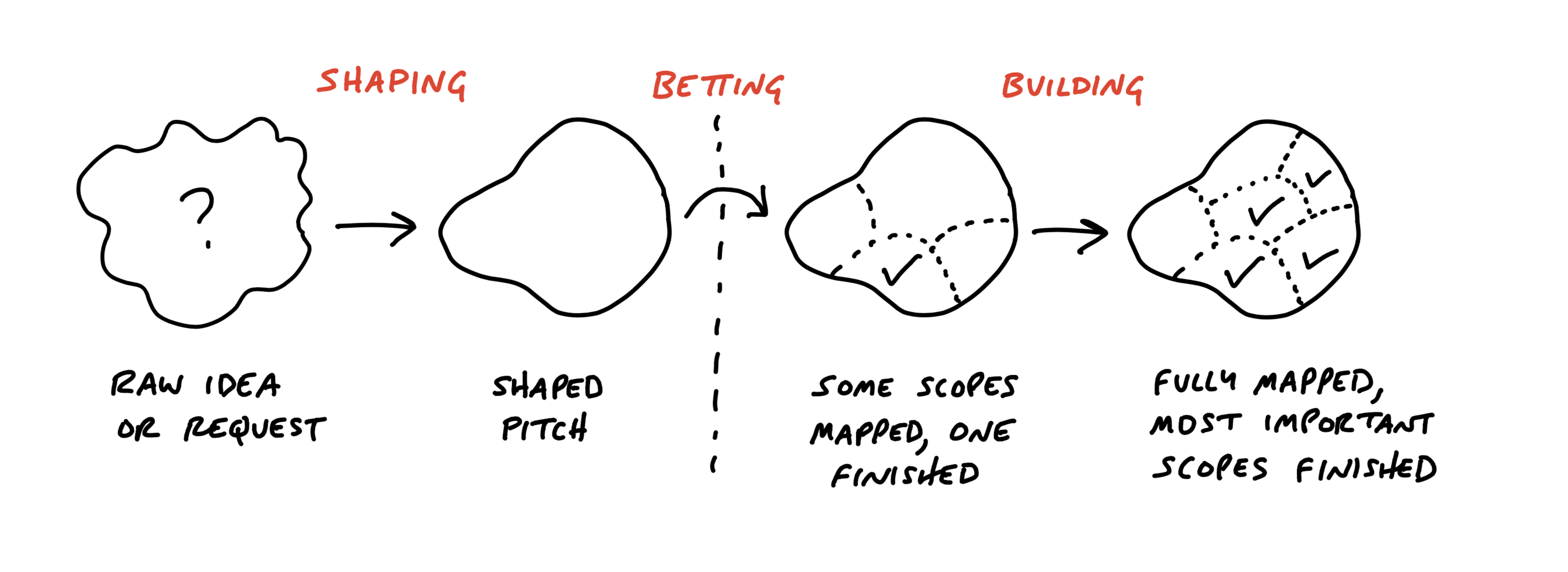
Scopes reflect the meaningful parts of the problem that can be completed independently and in a short period of time — a few days or less. They are bigger than tasks but much smaller than the overall project.
Shape Up - Chapter 12 - Map the Scopes
Map out tasks logically from the users' perspective, and work on an end-to-end slice - get things working in a browser as fast as you can!
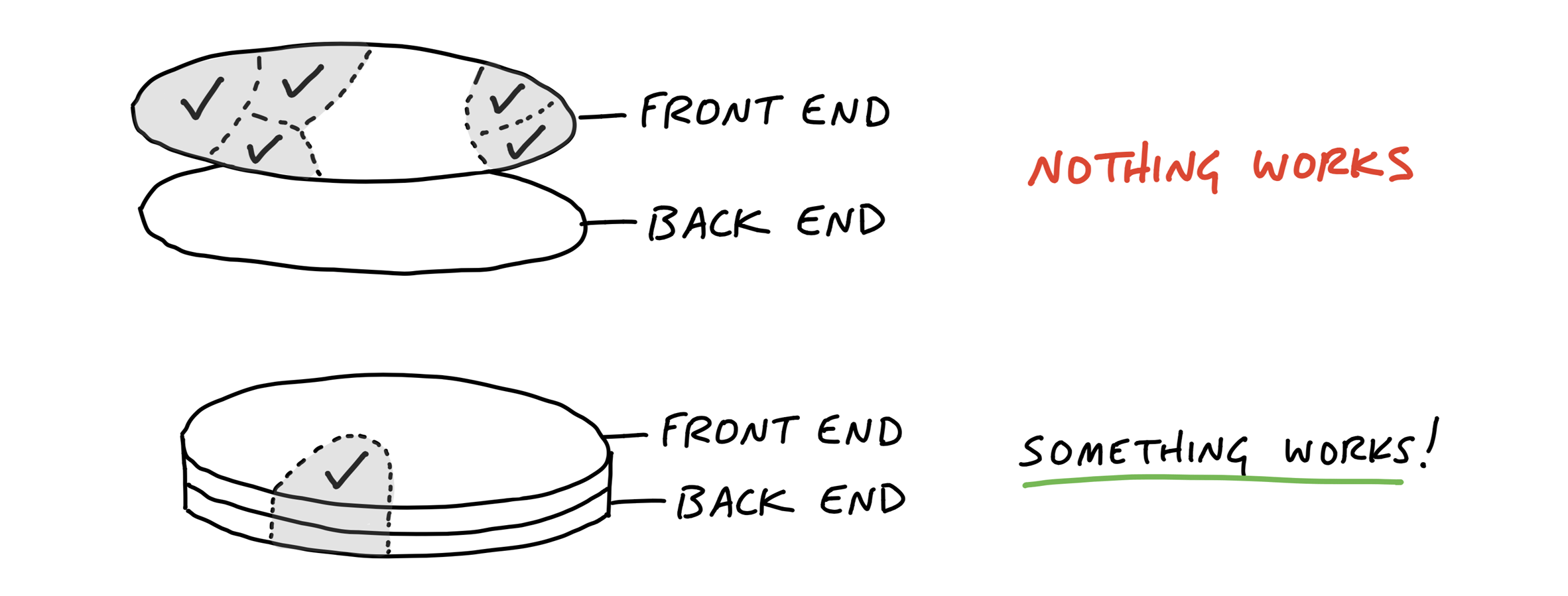
Design in Figma, but decide in the browser, where you can see realistic interactions and your results at all screen sizes. Design isn't complete until something is working for real in a web browser.
Designers: Divide all the things in your project into things that could function on their own, then design just enough to unblock developers. Even a sketch can be enough to get going with design polish later.
The results
A simpler-to-use user interface with a better information architecture and clearer signposts that tested well with users, who were able to complete tasks easier than before.
Through a careful reorganisation, and moving some things that didn't need to be used all the time down a level using progressive disclosure, we allowed users to focus on what they needed to do most of the time (edit stories) and deprioritised the things they did occasionally, while still making them obvious.
We made a much better responsive editing experience through the use of a responsive side panel.
Responsive challenges
The responsive nature was one of the hardest things to get right, as the app is 'desktop first' from our analytics, but we wanted to make it usable down to smaller screens.
We had a sticky header that hid the top nav but kept the action bar in place. Combine that with 2 levels of the collapsible nested sidebar, the first level which is shown inline on desktop, stacking contexts get complicated fast! Thankfully Ivan, one of the developers on the project was a complete front end wizard. 🪄
I could see some users had super wide screens, and some were on laptops. Some used multiple windows side by side, and cut and paste a lot of content in. Gone are the days of fixed breakpoints - we had to make the experience as fluid as possible.
Users often had long articles they needed to scroll, so keeping the top header sticky with publishing controls at hand was important, alongside sidebar options.
Responsive demo (view in browser for best experience)
Don't just design to bootstrap breakpoints. Look at your analytics and what your users use most, and cater to that. Think about really wide screens, and smaller ones, and the spaces in-between. Try on touch devices and different platforms.
A separate publishing workflow
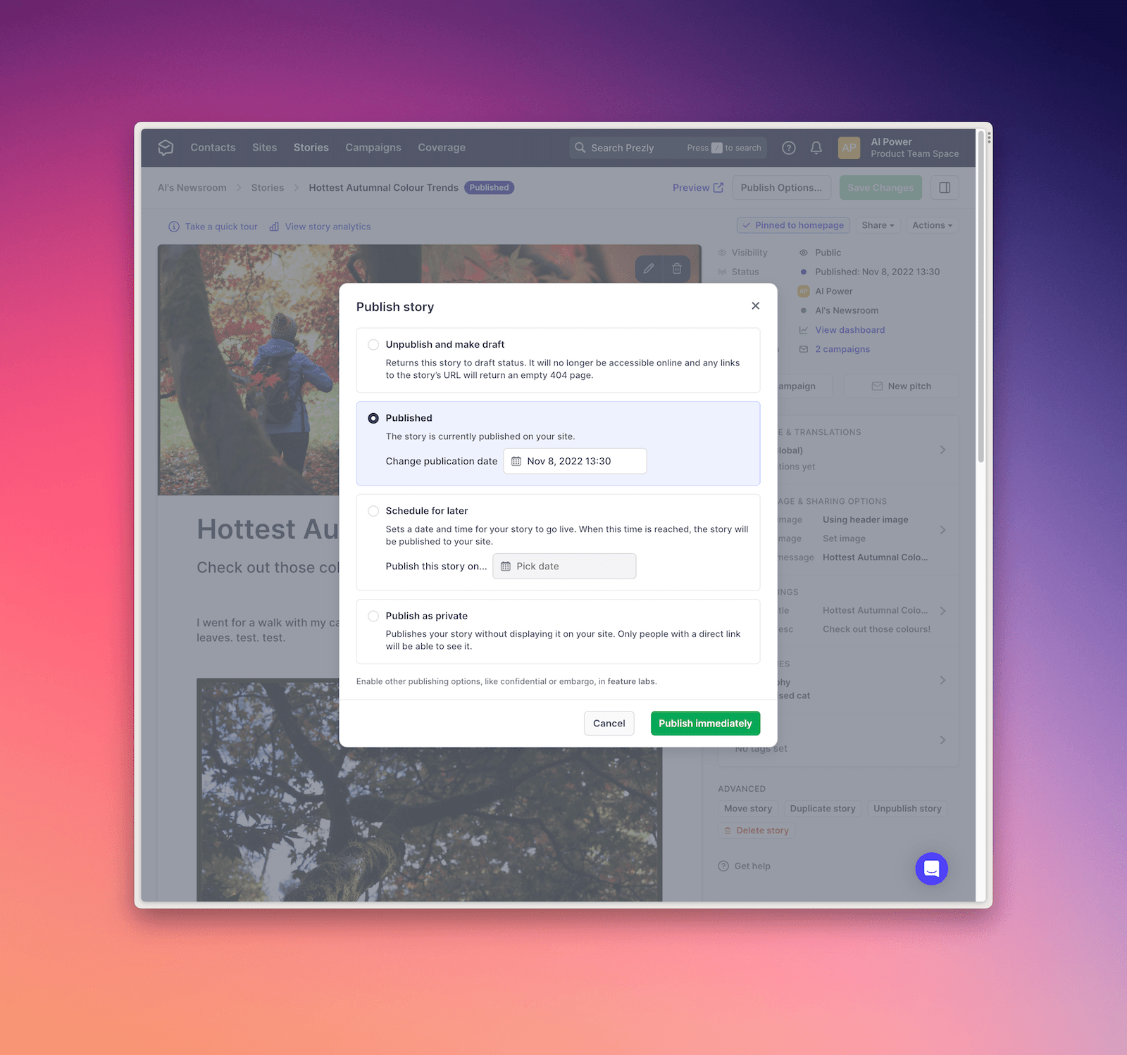
Publishing was moved into its own workflow (which we've simplified even more since). Why make people choose a date until they are ready to publish?
This is "The Principle of Least Effort" - people take the path requiring the least amount of mental and physical energy to complete a task, so the more you can chunk things together and only show them when they are needed, the easier it will be.
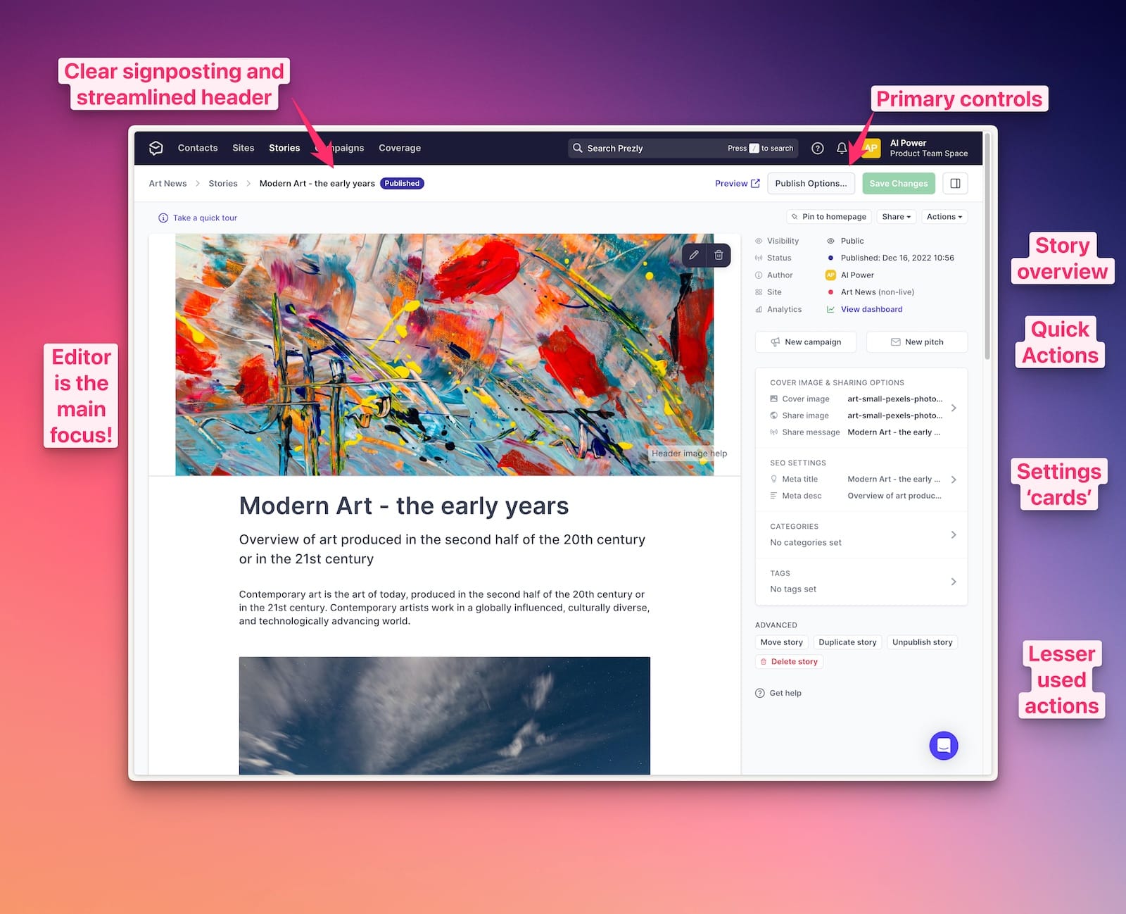
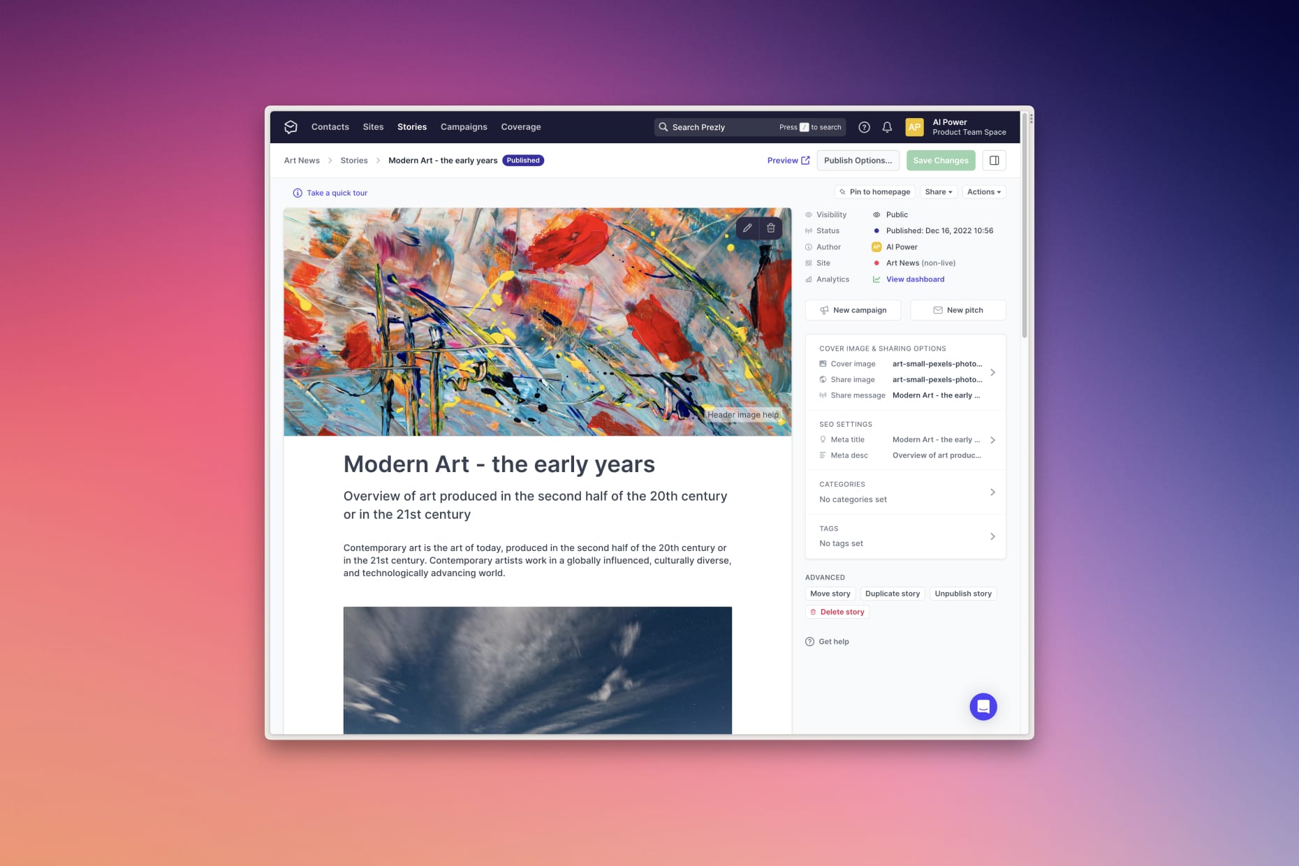
A clear overview section with settings cards and calls to action
Analytics and Stats were moved up a level to the sidebar for clarity, and a new overview section was created.
Showing the key information in a grid helped with scannability, and giving everything a label helped with clarity. I considered going without labels for the overview to save space, but given English isn't the primary language for a lot of users, I opted for clarity (again referring to my previously set principles).
I scheduled user testing over some time, so I could incorporate feedback as I learned things, asking open questions to dig deeper into people's understanding and ways of working and usually found something from each session that could be tweaked.
The whole sidebar was polished as best as I could to look good - the more aesthetically pleasing a design, the more usable it's considered (The Aesthetic-Usability Effect [4]).
We decided to deemphasise the sidebar from white to grey to sit a little further back and let the editor stand out.
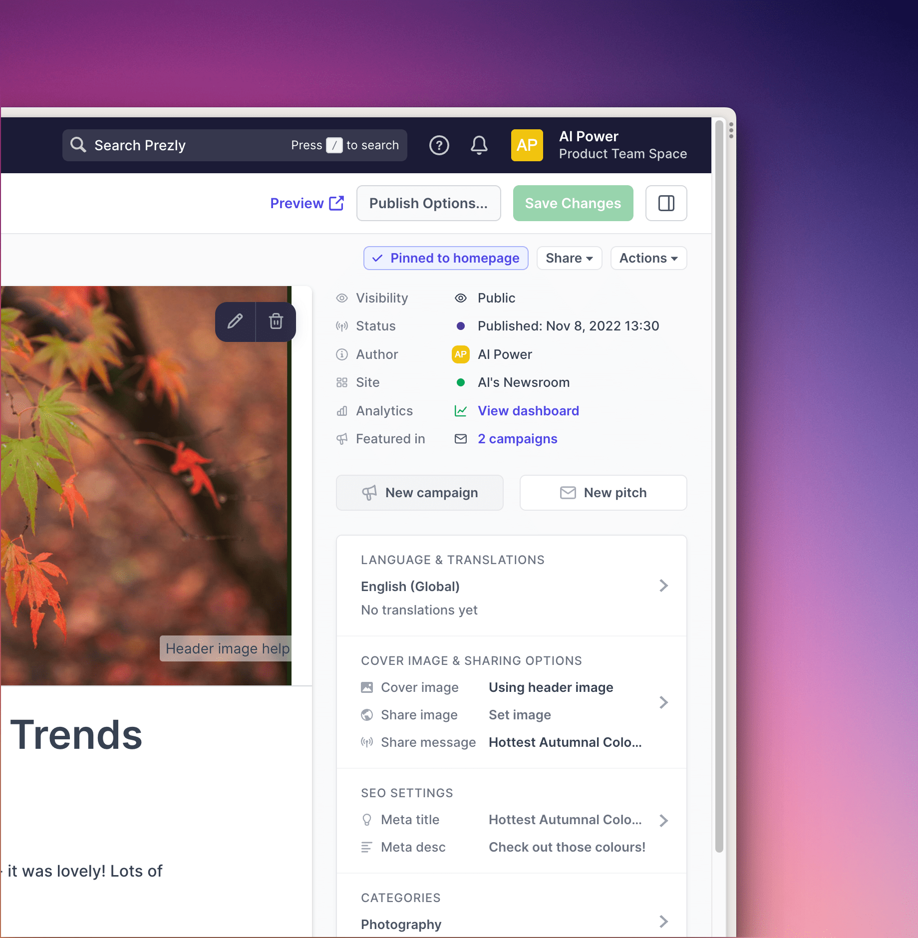
This was a designed as a platform to build on for the future: since shipping this the product team's added things like further SEO settings, clearer language options, better breadcrumbs, an ability to pin stories to one's homepage and more, all of which the new UI has happily catered for with room to spare.
Before/After demo (view in browser for best experience)
Things I'd do differently next time
Solve the hardest problem first. We left the responsive navigation part of the project towards the end, and this stopped us from releasing early, and it weighed on me.
Some things can't be broken up, but I'd have liked to at least ship something testable internally faster.
Ensure we had some of the key editor tasks smoke-tested using automated testing - even if throwaway tests - this would have saved a lot of last-minute bug fixes I think. The dev team have since rolled out some end-to-end testing which is already identifying small edge cases to fix.
In conclusion
Overall I was really happy with how this project went - there's always room for improvement of course, and a SaaS product is never 'done', but I'm already looking forward to how we can build and improve on this foundation we've laid.
In the interest of keeping this around 3000 words, my experience using Shape Up is something for another post (also coming soon!), but I love it, and it worked well in this case.
Thanks for reading! A big thanks to the editor project team (Ali, Ivan, Istvan, Klarissa and Oskar) and to my colleagues who cast an eye over this - any errors in the above are mine alone.
Any questions or comments? Get in touch.
HubSpot has a great guide to CES sessions by Grainne Smith, one of their Product Designers. ↩︎
...much like the Design Council's Double Diamond. ↩︎