Better UI design through first principles
Helping UX folk do UI design better - notes from my UXCampBrighton 2022 talk
After over two years of lockdown, I ventured out to my first conference face-to-face, and it was a tonic for the soul.
Held at PlusX in Brighton, UXCampBrighton yet again knocked it out of the park, with a solid lineup of great talks, and lovely folk. Most people masked up also, so it felt really safe.
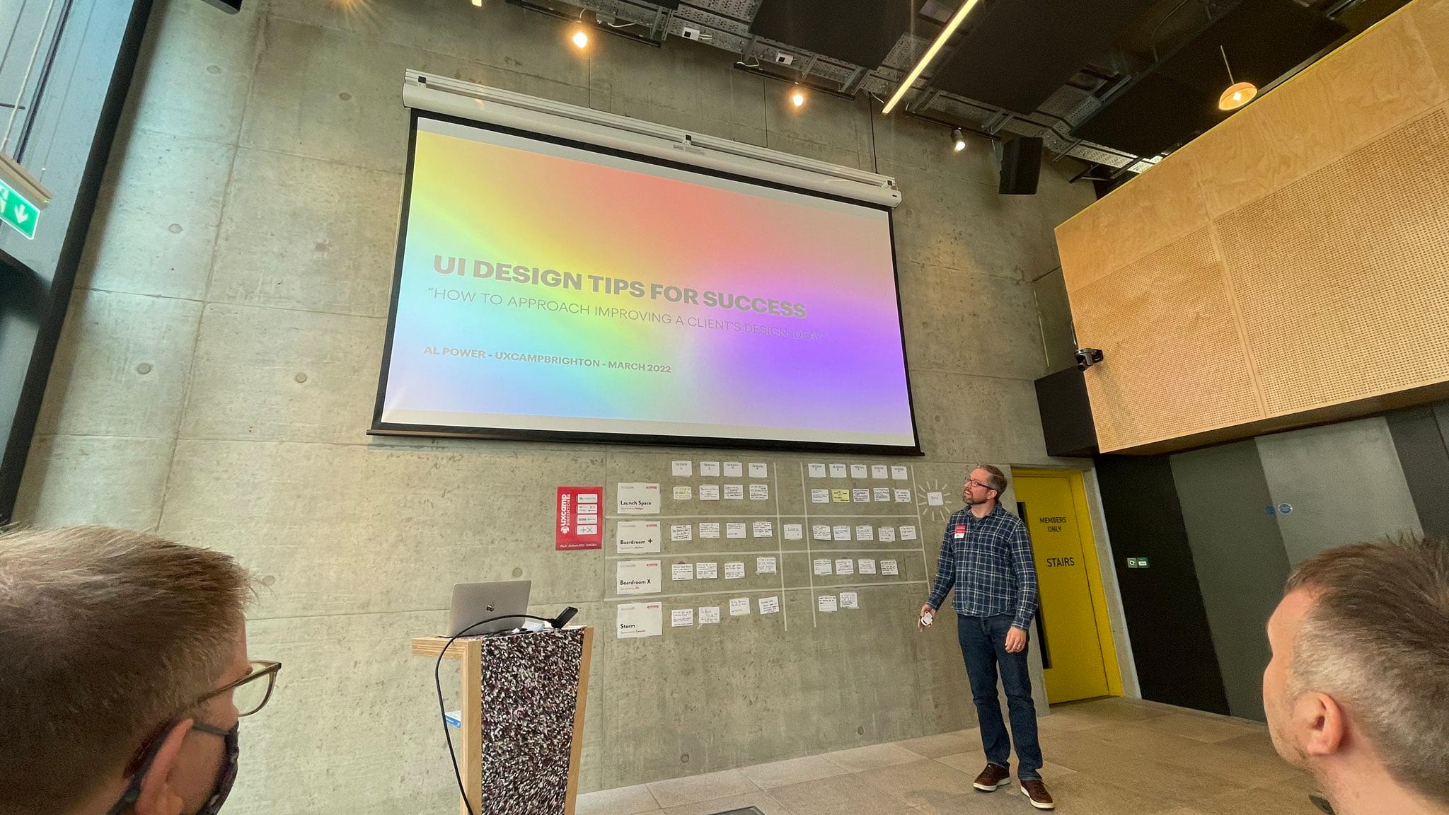
My talk was called UI Design Tips for Success but broadly it was a very visual talk that broke down approaching a bad design and improving it step by step using before/after examples. I only had 20 minutes, so had reduced things down to a high-level essence.
I looked at the cases where someone starting out in design's taste has levelled up before their actual UI design skills have, and some practices and principles on UI design one can take to remedy that.
I'm probably going to give the talk again soon, so won't spill all the beans, as it worked best listened to/seen, but a very high-level summary of the points were:
What is design?
Understanding what design is is key. I looked at the term 'aesthetics' (the philosophy of beauty and taste) and broke that down into two types of aesthetics:
Classical aesthetics
Think classic Braun design - clarity and usability. The essential function or nuts and bolts of a design.
Expressive aesthetics
Think artistic touches - a beautiful gradient or watercolour background behind a landing page - something not essential to a design, but that elevates it into something more beautiful.
For me, good User Interface Design has to focus on the former first, but also touch on the latter. Beauty cannot come at the expense of clarity.
Evaluating and responding to client provided design efforts
- Everyone thinks that they are a designer, so often you get clients coming to you with designs.
- Learn how to embrace that in a positive way, and use it as a tool to understand their needs more.
Principles of UI Design
Using that as a framing metaphor, I then ran through several principles of design:
Simplification
- Squint your eyes when evaluating a design. Notice what stands out and what doesn't.
- What is the one thing you want people to do above all else? Focus on that. People tend to only scan things, and you want your primary tasks to stand out.
Calls to action
- My worked-out example was a dashboard. Don't leave people hanging - if you can link through to deeper resources do so, even if they appear in the navigation. People don't always see navigation links, so the clearer you can make the 'what should I do next moment' the better.
Colour
- Beginners often go all-in on colour, but I like to start in grayscale first. This helps get the design right, before thinking about colour.
- Brand colour and emotive connotations are important. Think about what you want your users to feel about your brand, and use the right colours to support that.
- If you are starting out, stick with a primary brand colour.
- Use tints, shades and tones, by mixing your primary colour with different shades of whites and blacks to get a nice palette.
- if you need an accent colour, choose something from the opposite end of the colour wheel.
Typography
- I talked through serifs vs sans-serif and when to use them, how the character of a typeface is important, and can really add to the feel and tone of a design.
- I had some preferred fonts (mainly geometric sans-serifs like IBM Plex Sans and Work Sans), and showed some fonts to avoid (looking at you Papyrus).
- Talked through effective use of Google Fonts.
- Find a font with multiple weights - good for UI controls.
- If you are not a typeface expert, consider using a superfamily - a serif/sans-serif/monospaced font designed to work together - almost cheating it's so good.
Font size and reading distance
- Think about the context of usage - people hold a phone closer to themselves than say using a desktop computer, so adjust the font size accordingly.
- Headings can have tighter leading (whitespace between lines of text) than body fonts.
- I like 130% of font size as my leading.
- The bigger the font size, the less 'leading' you need.
Whitespace
- Whitespace is really important, and often underused. If in doubt double your whitespace.
- There's a reason expensive shop windows often look nicer - they have less in them and use whitespace (or negative space) well to draw your attention to things.
- Remove boxes and lines - new designers often use boxes and lines for a lot of things - you can use other things like whitespace, colour and contrast to organise things effectively while keeping things clean and feeling less cluttered.
Alignment
- Alignment makes things feel more designed.
- Use edge alignment for things that are similar in size, or align through the centre of mass for things that are different sizes.
- It's tempting for new designers to align text centrally, but it only works for smaller blocks of text - left is usually better for longer paragraphs.
Layout
- Because we are in a responsive device-agnostic world, we need to think about how our designs will flow into many different screen sizes.
- Don't use a strict grid - use relative spacing - position things relative to their nearest neighbout instead of using a strict grid, so things can flow responsively.
- I like units in multiples of 4px (4, 8, 12, 16,24, 32 and so on).
- Group related things together, and space unrelated things apart.
Bonus tips
- Darkness recedes, lightness brings forward. You can use dark and light colours to make things seem closer to the user (as it emphasises) and further away if darker (deemphasis). Useful for designing a dashboard with lighter panels
- Personalisation - if you know about a logged-in user, and whether they are new or not, you can show helpful guidance or messaging that's context-sensitive.
- Dark UI design overview - talked through Spotify and Netflix's use of dark UI design to emphasise media.
- Light falls from above - pretty much always put your shadows below things for a natural feel.
- Collect inspiration, test with users, and take a break if you are stuck.
In conclusion
UI design, especially starting from scratch or from a less-than-ideal existing design can seem overwhelming, especially for new designers. Break things down step by step and you'll be amazed how even just small changes add up to a more polished effective and usable design.
Resources
Because the talk worked through step-by-step visual changes before and after, it's too long for a blog post really, but I might well record the talk and put it up here at some point. For now though resources and links mentioned in the talk can be found over on my mini design tips blog.
Photo by Leo Barnes - thanks!