Use fewer borders
A simple trick for improving UI design
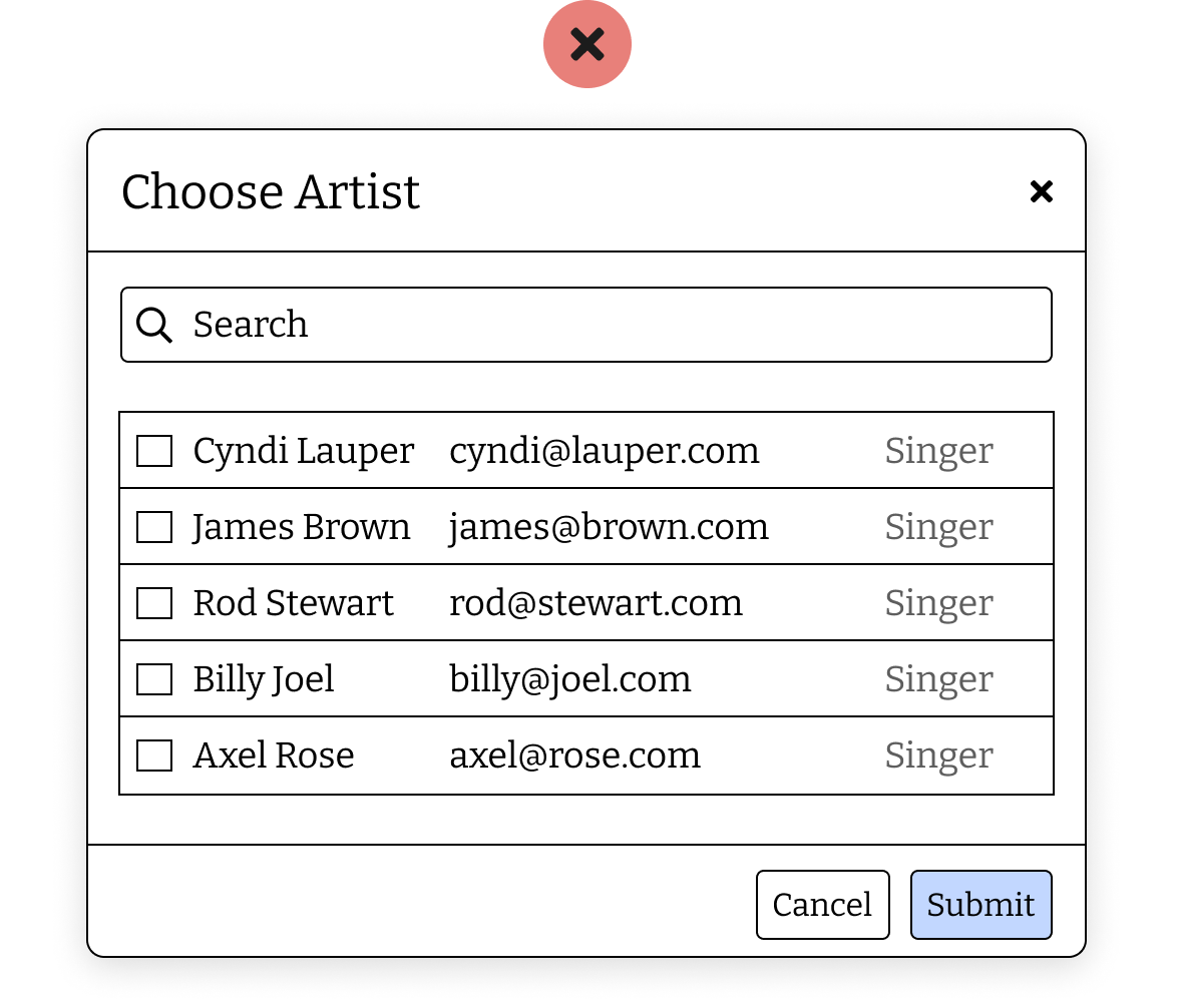
One of the classic mistakes I see junior designers is using solid borders on everything, from modals, to form fields to tables to separate things.
You can easily overwhelm a user interface with too many boxes and borders. If everything has the same emphasis, it's hard to see what is and isn't a control. The below example is contrived, but does highlight the point.
Too much going on can be too stimulating, increase visual clutter, and distract from the task at hand.
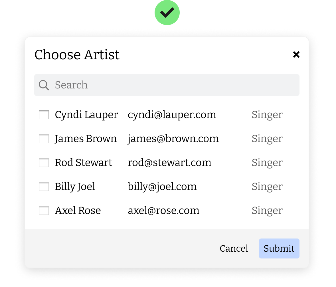
Borders aren't the only tool you can use. If you have form fields in your design, the edges of these can be user as separators.
Try using filled backgrounds, shadows or increase spacing between things instead of using lines to make your design feel more cleanly designed.
Next time you see a good clean design, stop and ask yourself 'why' and you'll start to notice these things.