Using animation for web UI
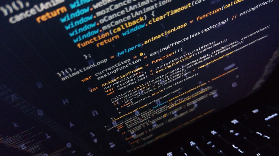
Since CSS animations were introduced back in the early 2000s, most other browsers have come on board with support. With the keyframes in the CSS3 animations module also allowing timings and more advanced properties, it’s amazing what web standards can accomplish.
Ever since our caveman days, the human eye is excellent at noticing movement, which is why animation, when done well can be so effective in modern well-designed applications.
Even in situations where you have a lot of text, animating things like illustrations can really being the content to life, like in this lovely XBox One review on Polygon.
However unless you are creating something purely for entertainment, animations should be kept short, to let users get on with the task at hand, especially if present on a much-visited element of the UI. The key is to use it to enhance rather than take over an interface.
As the Apple Developer Guidelines state:
Don’t use animation for the sake of using animation. Excessive or gratuitous animation can make people feel disconnected or distracted, especially in apps that don’t provide an immersive experience.
Be realistic and strive for credibility. If a user opens a menu by swiping down, then they should be able to close it by swiping up.
Animation has several different uses within modern web and mobile applications, such as:
- Showing loading states
- Assisting with wayfinding
- Guiding attention and focus
- Conveyance of brand, voice and tone
...and I'm going to cover a few below, with the help of my favourite Marvel superhero.
Loading states
Historically animation has been used for things like the much abused and ubiquitous spinner, useful when you are loading something else that might take a little time - in this case it just repeats until the content is loaded in.
The problem with this is that a never ending spinning circle can cause people to think a system has stopped responding.
An alternative to the endless spinner is to use Skeleton states. Skeleton screens are used by several companies to good effect, to improve perceived loading speed, by presenting an intermediary placeholder structure instead.
Both Medium and LinkedIn use skeleton structure to good effect.
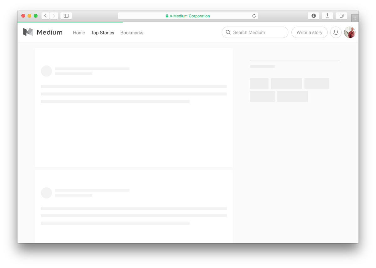
Not only is this nicer to look at, but this helps with user understanding by showing the structure of something before it is loaded. My example below:
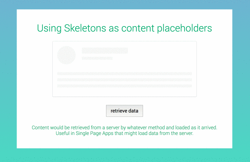
The human brain is very good at pattern recognition, so if presented with the shape and structure of content before loading, which is then replaced when content is loaded in (usually with JavaScript), the user already knows where things are at a rudimentary level, and will have an easier time finding their way about.
Granted, technically the only animation is a subtle CSS animation of the skeleton background colour, but I think it's a nice touch to show something is incoming, and the gradual replacement of content is animation in itself.
Attention and focus
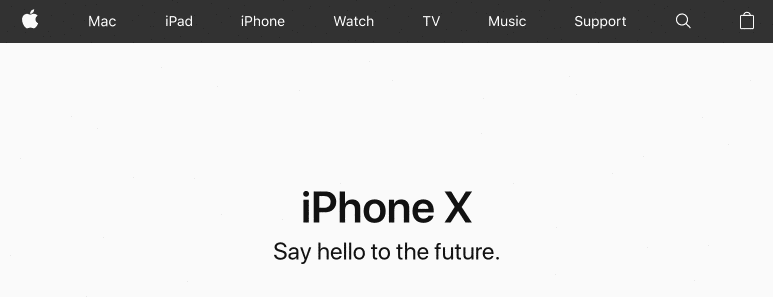
Animation is very good for highlighting things like buttons and adapting form fields when things are added or changed. Apple do a great job of this with their search box.
A nice example of this is the floating label pattern, that uses the form label as a placeholder text, and then floats this above the form field when the field is focused. It's subtle, but nicely and cleanly done using just CSS transitions and transforming using translateY, and shows the user subtly which fields have been completed, and which are yet to be filled.
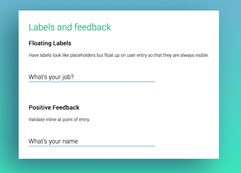
CSS animation can also be used when validating forms to great effect as people fill it out for more immediate feedback.
Further reading and details on the origins of this and pros/cons by Brad Frost.
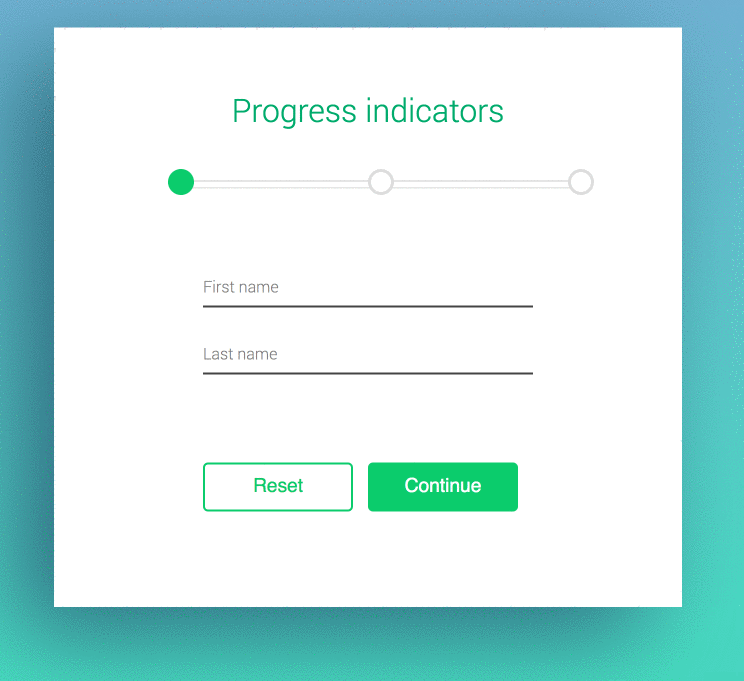
Wayfinding
Progress indicators can be really useful in showing people where they are in a multi-stage flow. If a progress indicator is just statically changed from screen to screen, it's sometimes hard for the user to notice the change. A little bit of animation can go a long way, and make the user feel like they are achieving something. Here the HTML5 progress indicator is used, and both the fill and the circles and form position are animated using CSS, with form interactions handled by JavaScript.
Further reading on progress bars
Conveyance of brand, voice and tone
We all know famous digital brands that we can recognise by recognising a part of their user interface. As well as voice and tone of copy, animations can really help cement what a company is, through ensuring things like the speed of animations match their personalirt (using things like easing functions to change how animations behave). Changing these can add to a sense of fun in some cases, or seriousness in another - there's a great article with further details here.
MailChimp does this well when you send a campaign with their big red button.
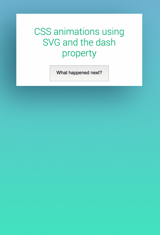
Here I've just loaded an SVG element that uses a dashed stroke, which is then animated using CSS for a but of fun.
Further reading on SVG line animation
I've really only scratched the surface of what is possible using CSS with a little JavaScript, and there are loads more out there on sites like CodePen and CSS tricks. Here are some good further resources:
Resources:
Nice intro to CSS animation by Rachel Cope on the thoughtbot blog
LukeW - How to avoid loading indicators.
Hover.css - some really nice CSS3 animations, ready to use.
One of the best writers on animation on the web today, Val Head has some excellent resources.
cover image credit: Irvan Smith - https://unsplash.com/photos/5eBW5GomfhY
tags: design